MH
Macaleigh Hendricks
UX Research + Design, Videography, Ecological Restoration, Community Building
About Me

macaleighh@gmail.com
(808) 298-6755
My name is Macaleigh (muh-kay-lee). I currently live in Los Angeles with my two cats. My goal for my career is to contribute to the needs of society in a meaningful way—principally in the fields of environmentalism, labor rights, mental health, and land occupation. I particularly resonate with approaches to these topics that feel handmade and are co-created with members of the communities they affect.
University of Southern California
M.S. Social Entrepreneurship, 2022
B.S. Business Administration, 2022
Minor in Cinematic Arts
My current driving question:
What brings communities together, and how can we channel it to meet our needs and the planet’s needs (and enrich our lives in the process)?
Videography
Community Garden Tour
Producer, Videographer, Editor
dispLAced: Leimert Park
Co-Producer, Videographer, Editor
Synopsis: A story of how love shapes a politics of resistance, resilience, and belonging within Los Angeles' Black cultural center, Leimert Park
How to Prepare and Cook Nopales
Producer, Videographer, Editor
Five Plants for your Southern California Food Forest
Producer, Videographer, Editor
John D. Liu @ The BirdHouse (Part 1): True Wealth & Imagining a New Economic System
Editor
UX Design
Life Buddies
Spring 2022
User Research and Front End Design Lead
Created using Figma
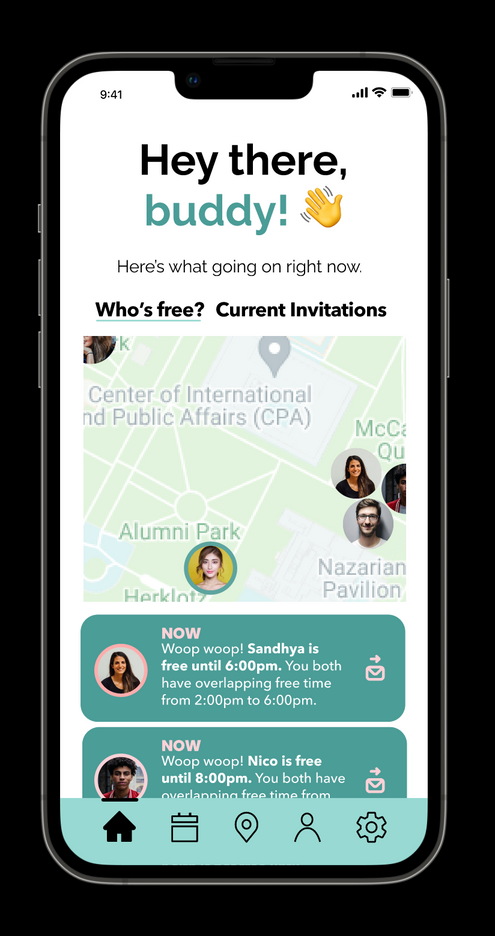
“Life Buddies” is a scheduling tool that finds ways to use your spontaneous free time to connect with your friends.
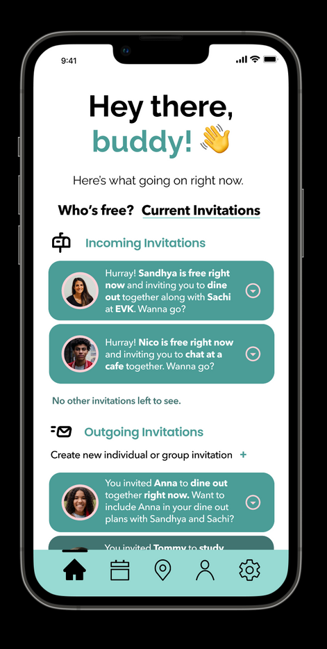
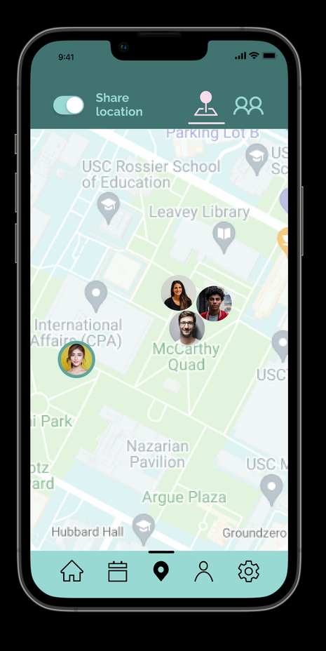
Users can view current invitations from their friends, see who is available based on their friends inputted schedules, and view the locations of their friends who have location enabled.
Sign of the Times
Spring 2021
User Research Lead
Dining supplies for family members to bridge the generation gap, share their value systems, and listen closely.
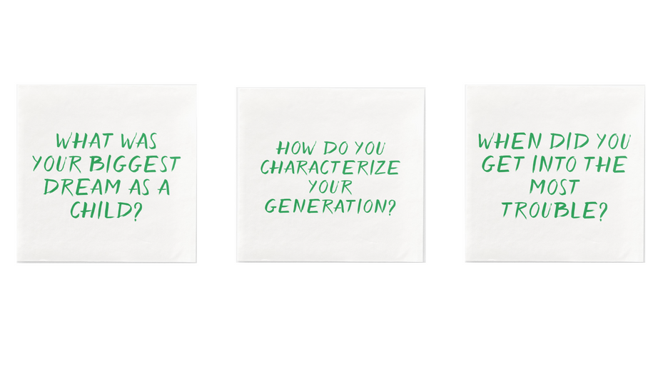
Although the above product may seem quite simple, it required in-depth conversations with 90 older adults.
Our team went in open minded, with the goal of designing a product to improve the lives of older adults. One of the primary challenges that we encountered was a feeling of emotional distance from younger relatives.
The
Process
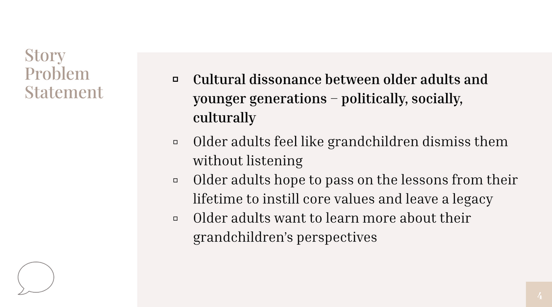
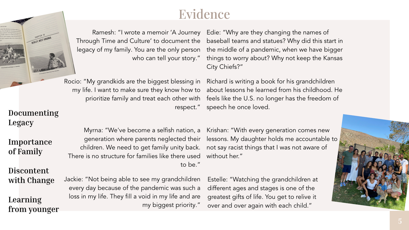
Over the course of several months of conversations and co-designing sessions, we landed on utilizing the opportunity of holiday meals to bridge this gap. We created a napkin set containing questions designed to help family members from different generations understand each other better.
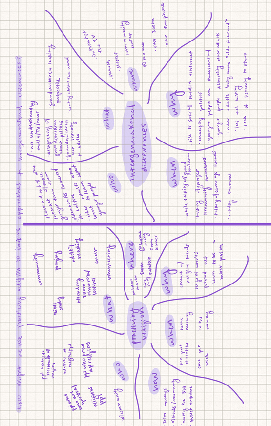
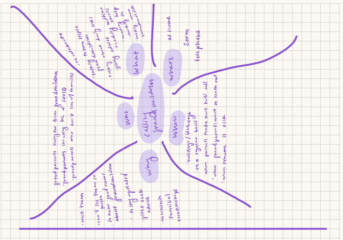
Field Notes & Mind Mapping
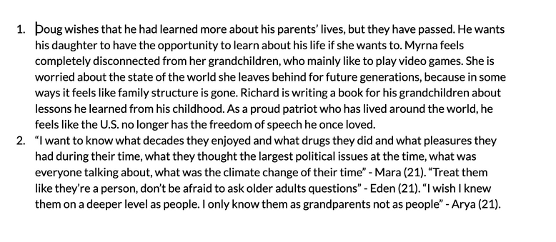
Mapping
Mapping Air Toxics in Los Angeles
Spring 2020
Made using ArcGIS
In this assignment, I used census tract data to determine the relationship between toxic air pollution and income in Los Angeles, California.
A small orange circle indicates a low level of air toxics, and a large circle indicates a high level.
Several of the largest emitters are near the boundary of a middle income neighborhood and a low income neighborhood.
Considering that in Los Angeles, one street can be very different in terms of quality of living, real estate value, occupation, and overall demographic than the next street over, I would be interested in repeating this exercise using a more localized form of spatial data unit, perhaps by street.
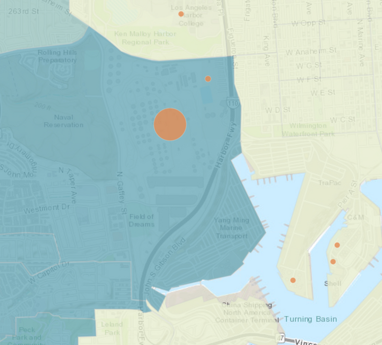
Low Income


High Income

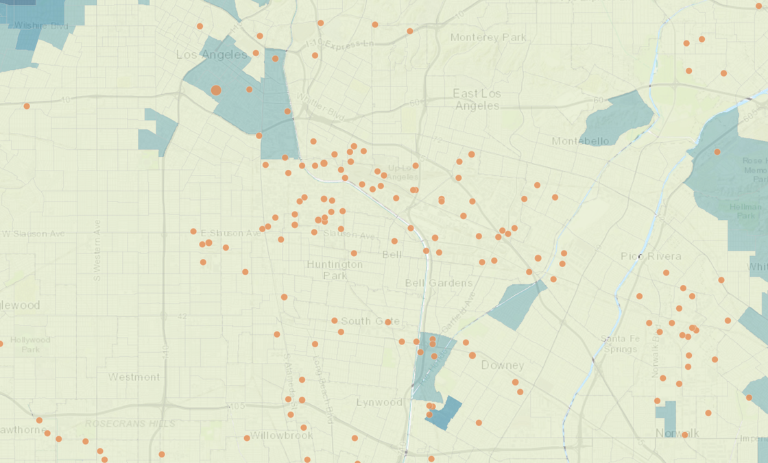
Although several of the largest emitters are near the boundary of a middle income neighborhood and a low income neighborhood, low income neighborhoods tend to have the highest concentration of TRI (toxic release inventory) emitters.
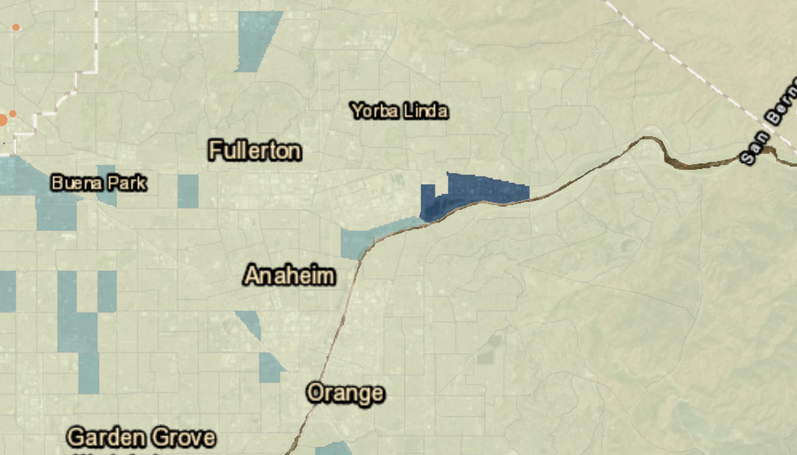
Because I am from Hawai’i (but not of Native Hawaiian descent), I was curious to examine TRI emissions in relation to race.
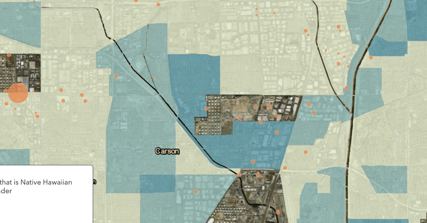
Is the Native Hawaiian population in Los Angeles living in areas of high TRI emissions?
I found the largest concentration of Native Hawaiian residents (in the 29-76 percent category) to be near Fullerton, and it is nearly free of TRI emissions, which is surprising and fantastic. Sadly, in Hawai’i, many Native Hawaiian residents live in low-income communities that are more likely to be polluted by large highways and industry.
However, a less dense in Pacific Islander resident region (shown below), was highly polluted in terms of TRI emissions. It is very near Torrance, where several of the largest emitting sites in LA are.
Mapping Billboards in Los Angeles Neighborhood Councils
Spring 2020
Made using ArcGIS

In this assignment, I sought to understand the relationship between population density and the amount of billboards throughout Los Angeles.
The yellow-orange gradient in the above map represents the population density, with the darker orange hues corresponding to a denser population within that neighborhood council.
The map shows that there are more billboards in neighborhoods with higher population density. In a city like Los Angeles, neighborhoods with lower population density tend to be higher income and have larger and more spread out properties. For this reason, billboards are likely more expensive to purchase. Residents also typically have more purchasing power to prevent unwanted development in their neighborhoods.
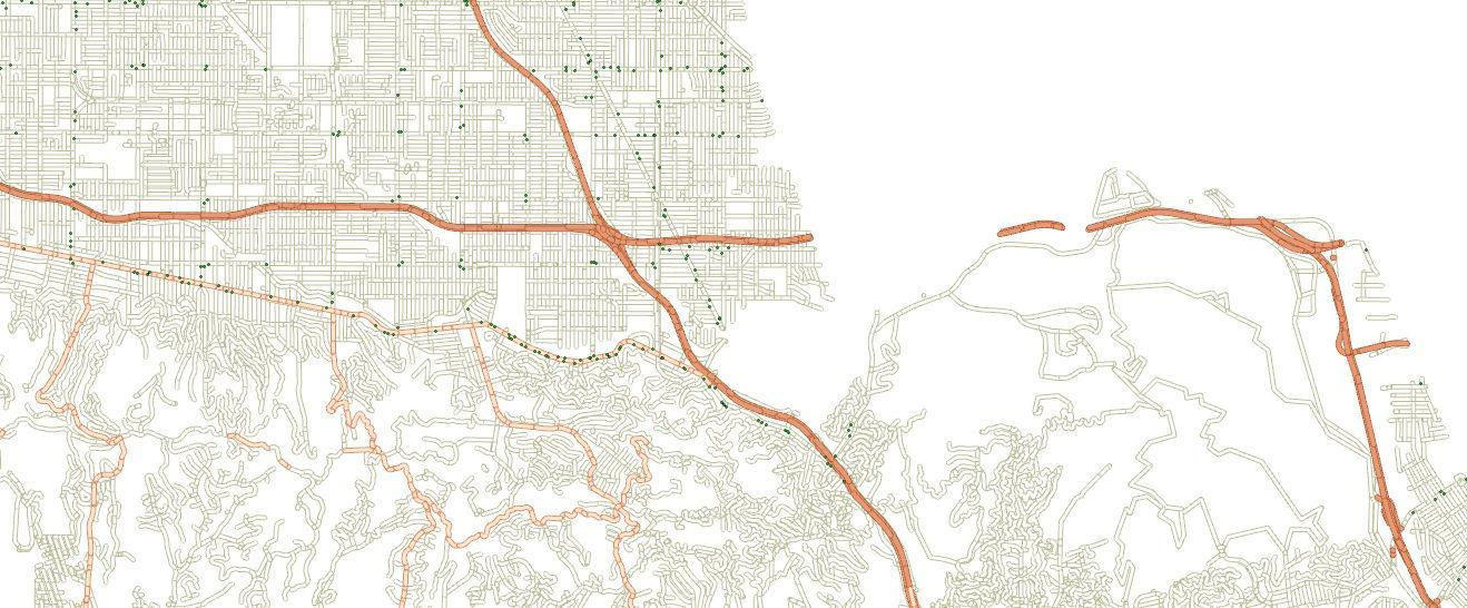
Pictured above are the 101, 134, and 5 freeways in LA, stretching from West Hollywood to Glendale and from Burbank to Hancock Park. Billboards are represented by small blue circles.
Also in this assignment, I found that the majority of billboards are located along secondary roads in Los Angeles. My hypothesis for this was that advertisers are more interested in advertising on roads closer to their businesses, where the speed limits are lower.
